BERKSHIRE GREY
Automated Robotic Fulfillment HMI
UX & UI
Human Machine Interface: 1920 x 1080
/01 - Overview
Engagement Overview
Online shopping has been pushing the shipping & fulfillment industry to the limits, especially with the conditions brought on by the pandemic. Berkshire Grey’s HMI platform enables operators to manage fleets of hundreds of autonomous robots in warehouses as they hold, store, and fulfill shipments.
Berkshire Grey (BG) wanted an improved UX and modern UI to make it easier for anyone to operate their platform. Our objective was to decrease onboarding time for new operators and to help users ensure that BG robots are operating effectively and meeting contractual performance obligations.
We went through a full design process (~9 weeks) and delivered a tested and vetted prototype with a full design system for their internal team to own.
Links & Press
Project Goals
• Identify & design 5 key use cases for robot operators
• Decrease new employee training time
• Proactively raise & resolve robot issues
• Meet contractual obligations to warehouse clients
• Deliver vetted designs & design system to client
Project Outcomes
• Enabled new operators with high school diplomas/GEDs to onboard and train in just two weeks
• Nominated for the 2023 UX Design Awards
Role, Team & Timing
• My Role: UX/UI Designer
• Larger Team: Product lead with Hayden Design House, Smart Design project lead, Berkshire Grey stakeholders
• Timing: ~9 Weeks
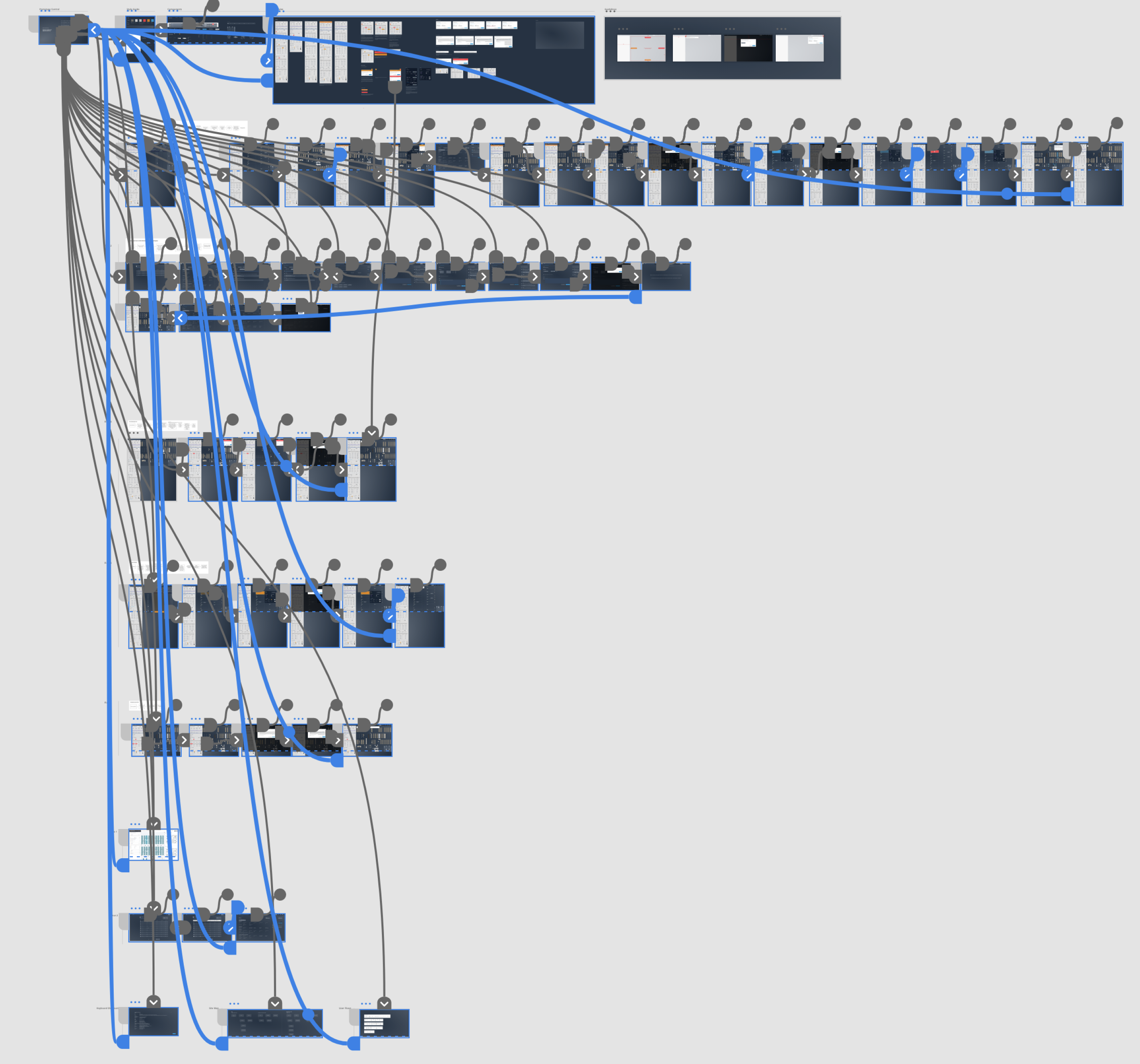
/02 - Product Preview
Berkshire Grey Preview - UI shown at 1:10 in video
Design Phase
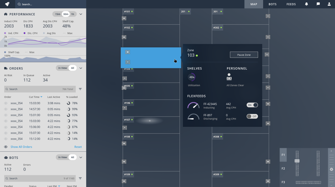
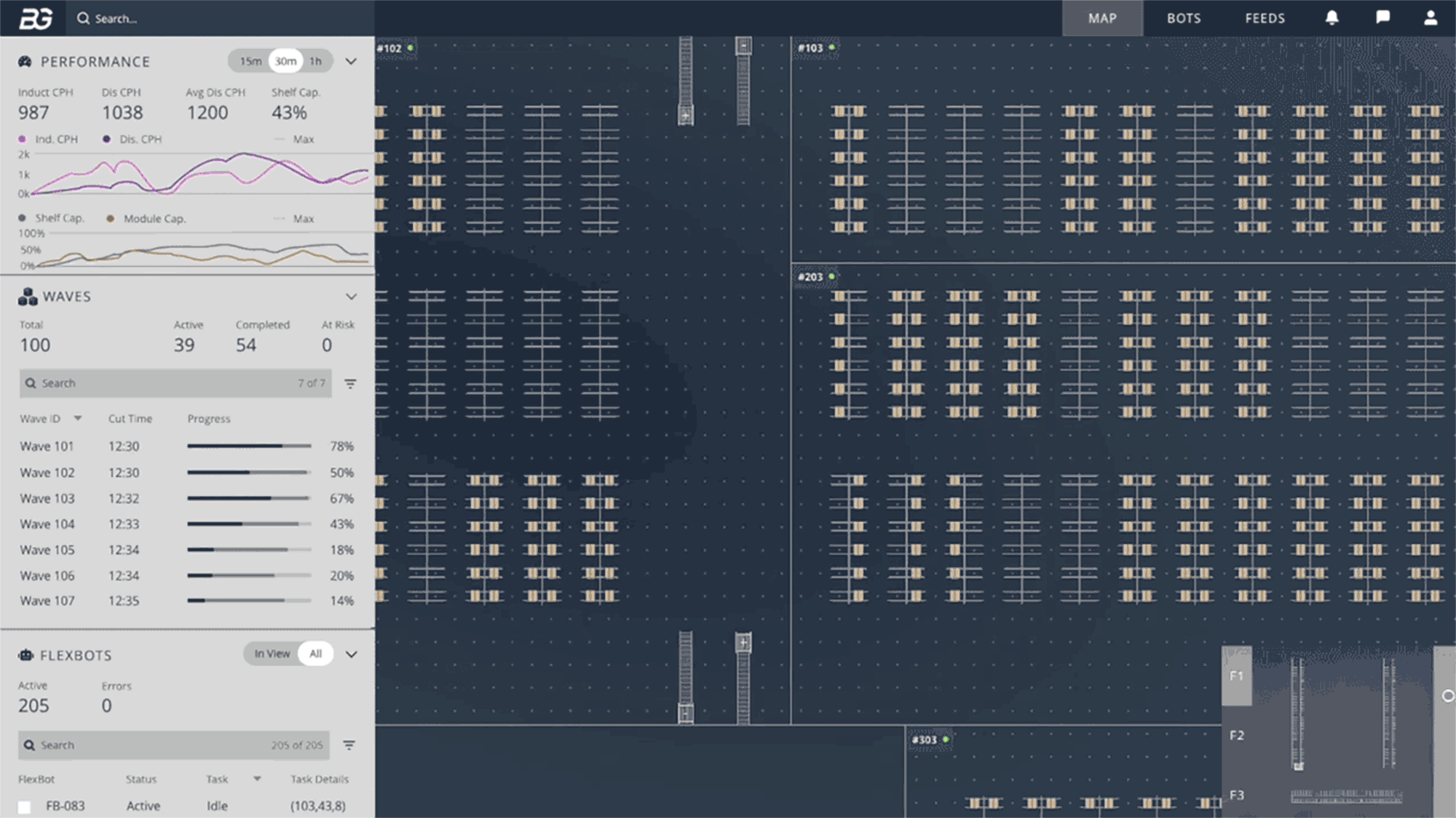
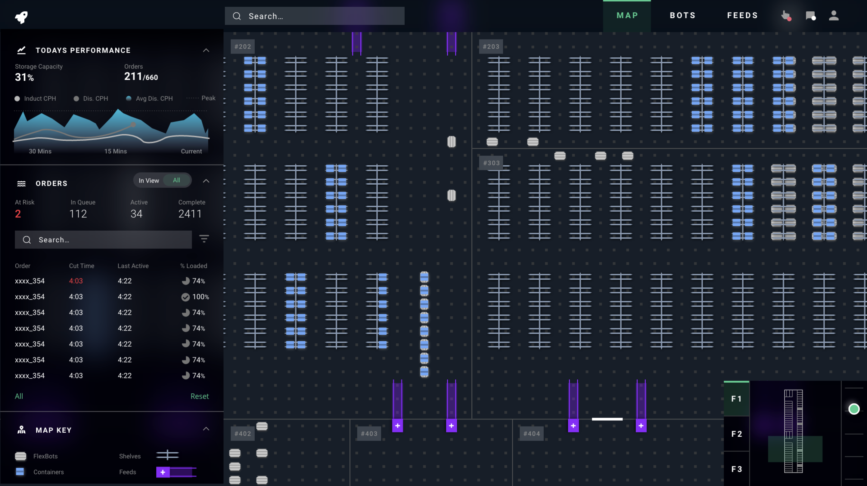
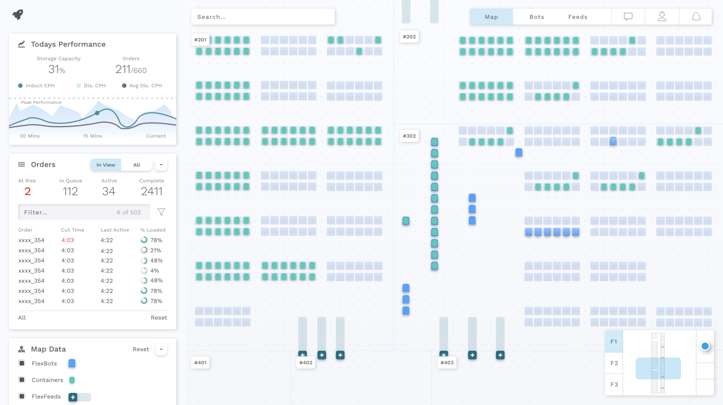
1. The most zoomed out view of the warehouse showing all the separated floors in one view w/ their different "zones."
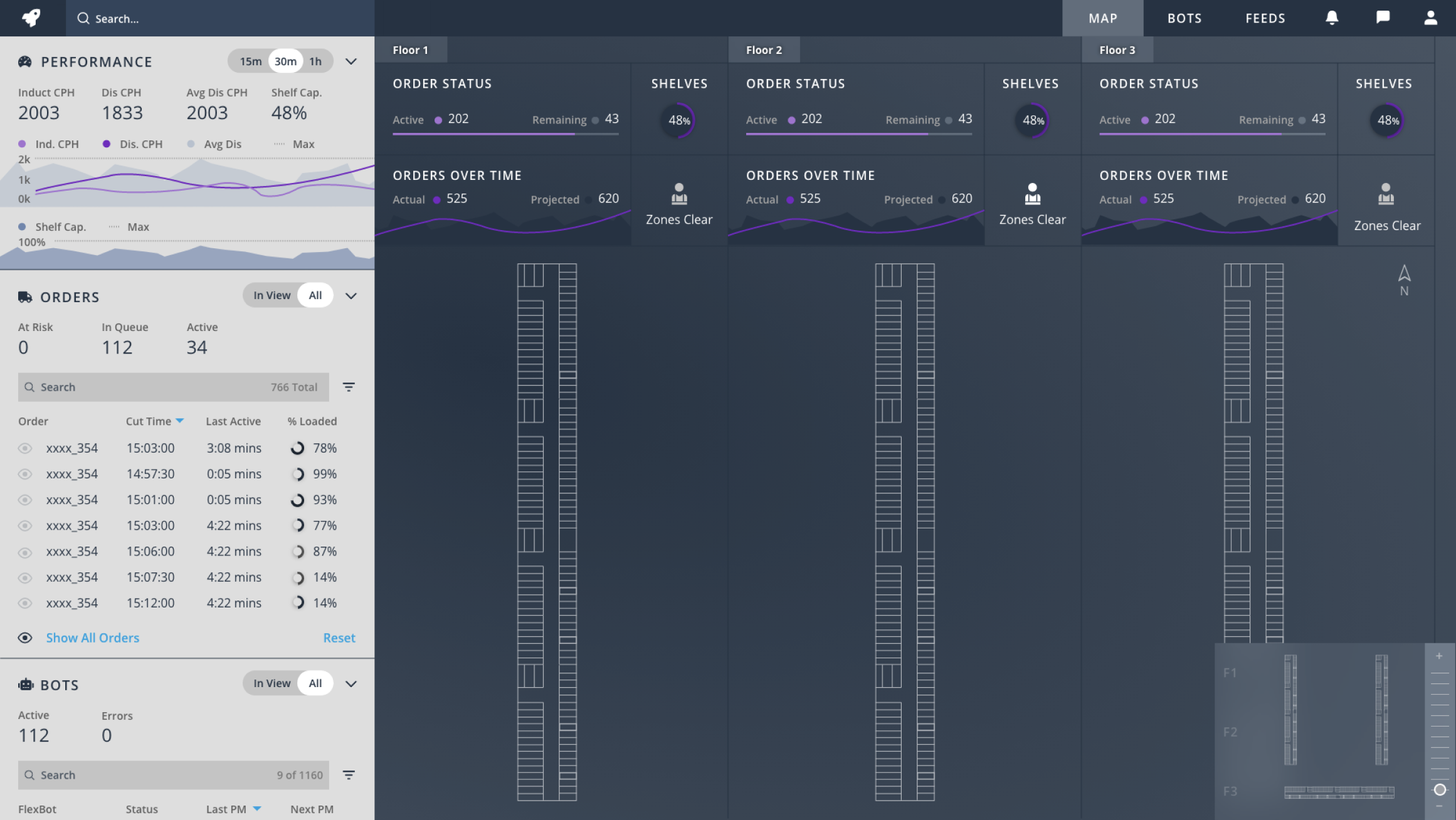
2. Halfway zoomed in view of one specific "floor" with the status of each zone and the individual flexfeeds feeding and removing containers.
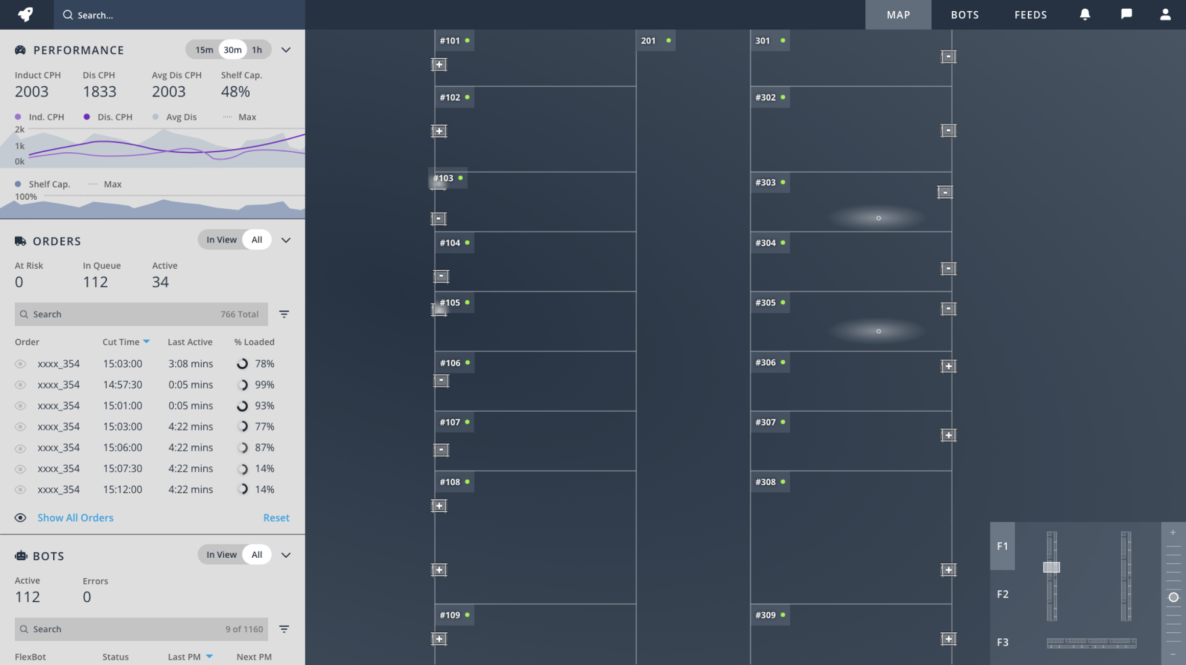
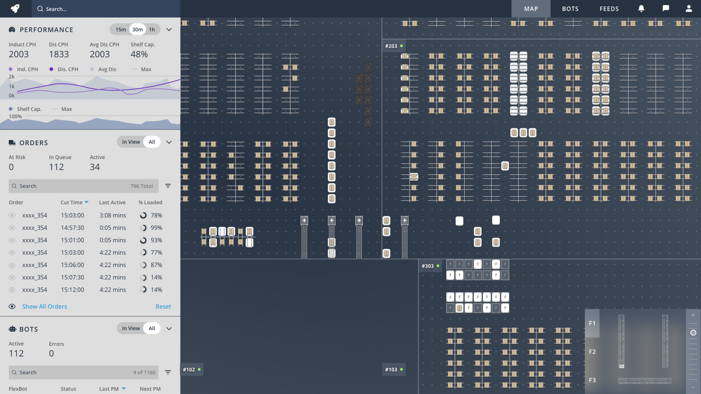
3. The most zoomed in view of a warehouse. Gives user ability to see in real-time the robots, containers, zones, and other specific floor elements.
4. Example alert showing when an issue arises that needs MC attention. (MC is our main user group and responsible for robots and delivery wave times).
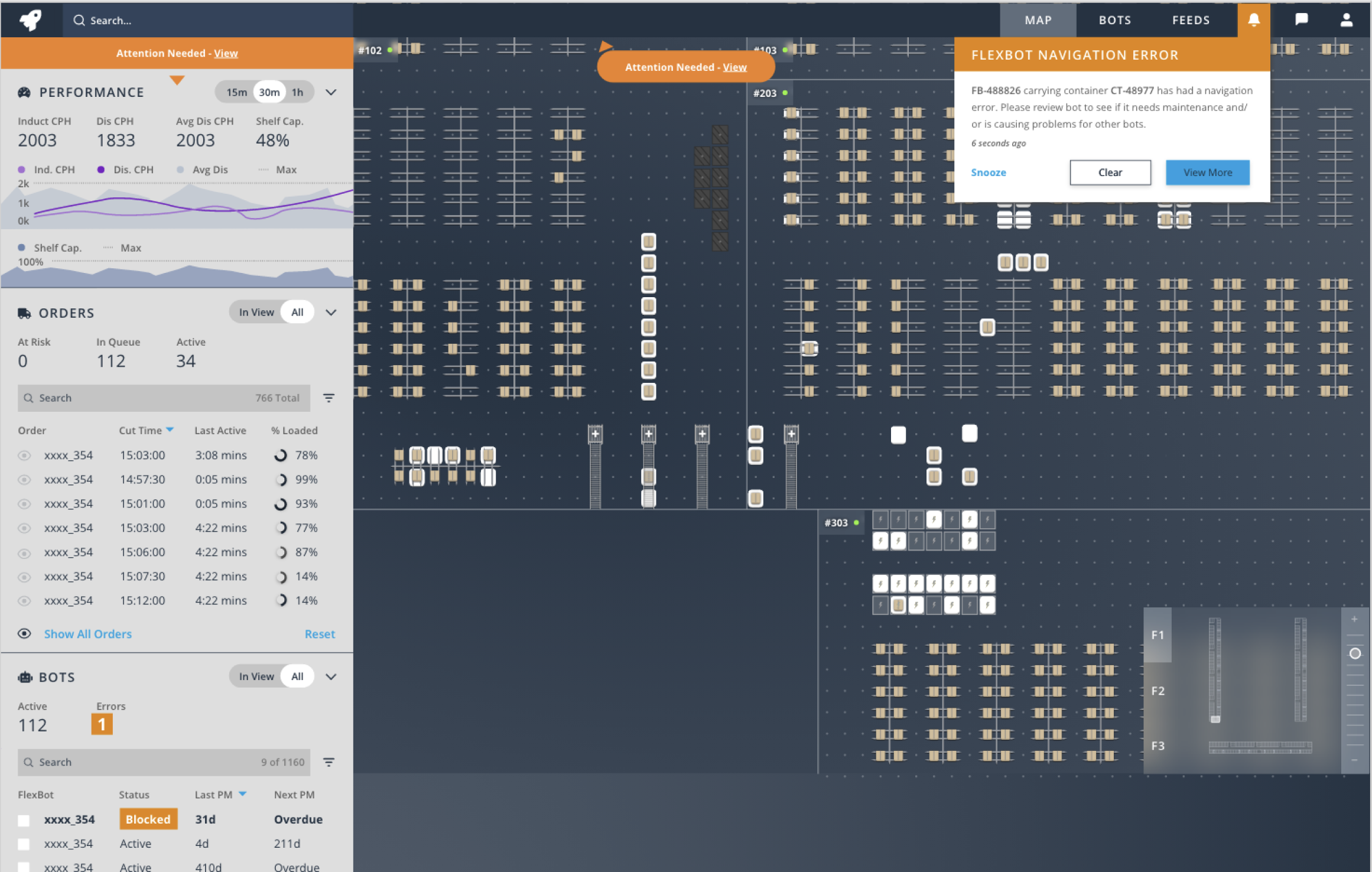
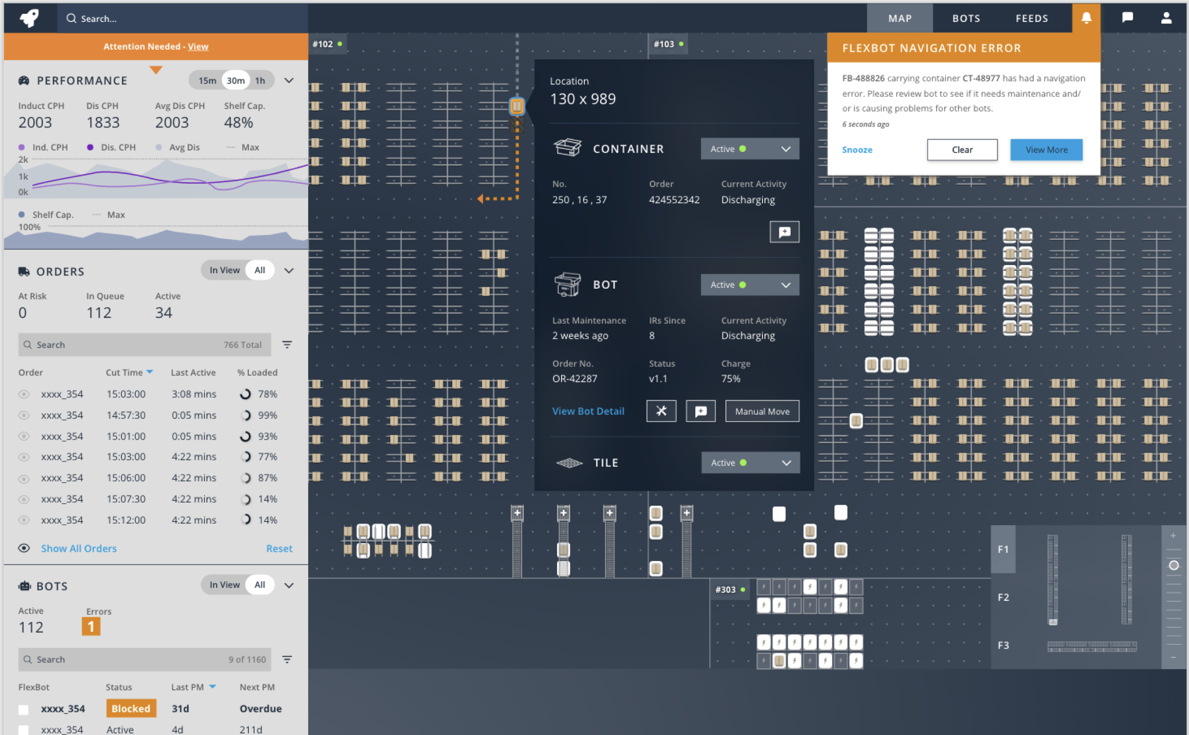
5. Flyout panel that allows us to interact with the different objects within a space. This includes the floor tile, the robot, the container, the storage shelves, and the bot charging stations.
This menu is where most MCs will perform actions to alleviate issues on the field.
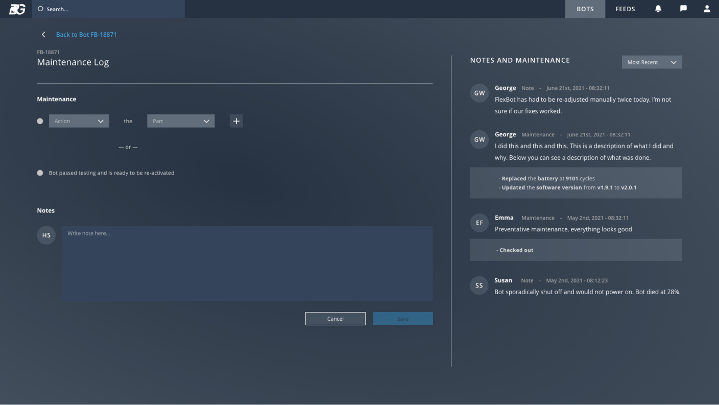
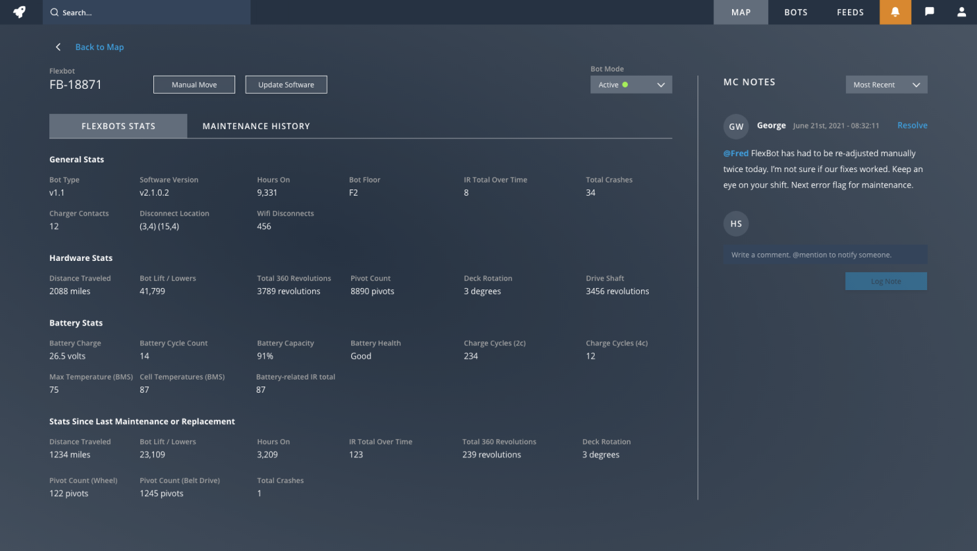
6. The secondary view is helpful for flexbot mechanics to diagnose and fix issues as well as have an idea of what future issues will likely arise.


/03 - Design Process
Discovery Phase
• Jobs to be done exercise
• Stakeholder interviews
• User interviews
• Competitive analysis & HMI inspiration
• Determine key use cases
• Capture existing user journies around key use cases
Defintion Phase
• User-driven feature prioritization
• Created new conceptual user journies addressing existing painpoints and new enhancements that make operators' lives easier
• Conceptual wireframing
• Concept testing
Design Phase
• Finalized user flows
• Created 3 initial tool layouts via wires
• Two rounds of user testing on wireframes
• Created 3 visual direction options
• Built style guide and created the component library
• Created high-fidelity visual prototype
• User tested one more time
• Final design tweaks and handoff to client
/04 - Discovery
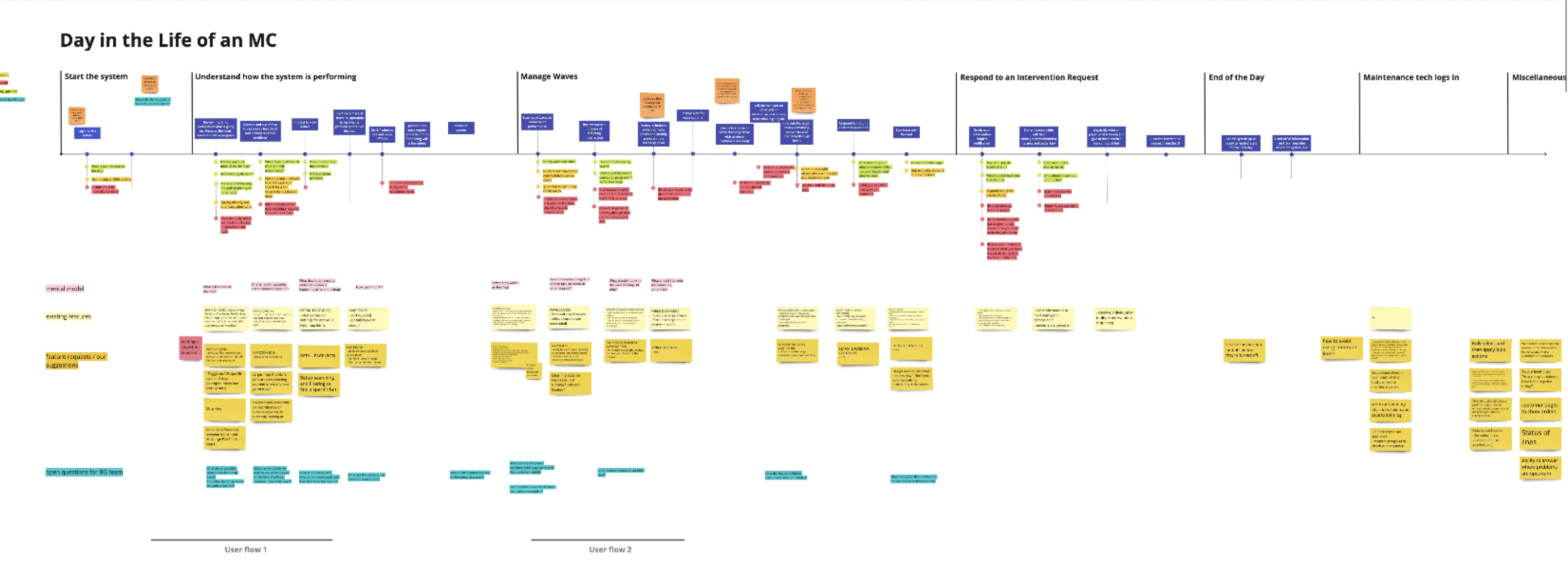
First we created this user journey that helped us visualize and understand the life of an MC. This board covers the general responsibilities and common tasks an MC performs, their pain points and other issues, the tools they use today, and opportunities for them to do better.
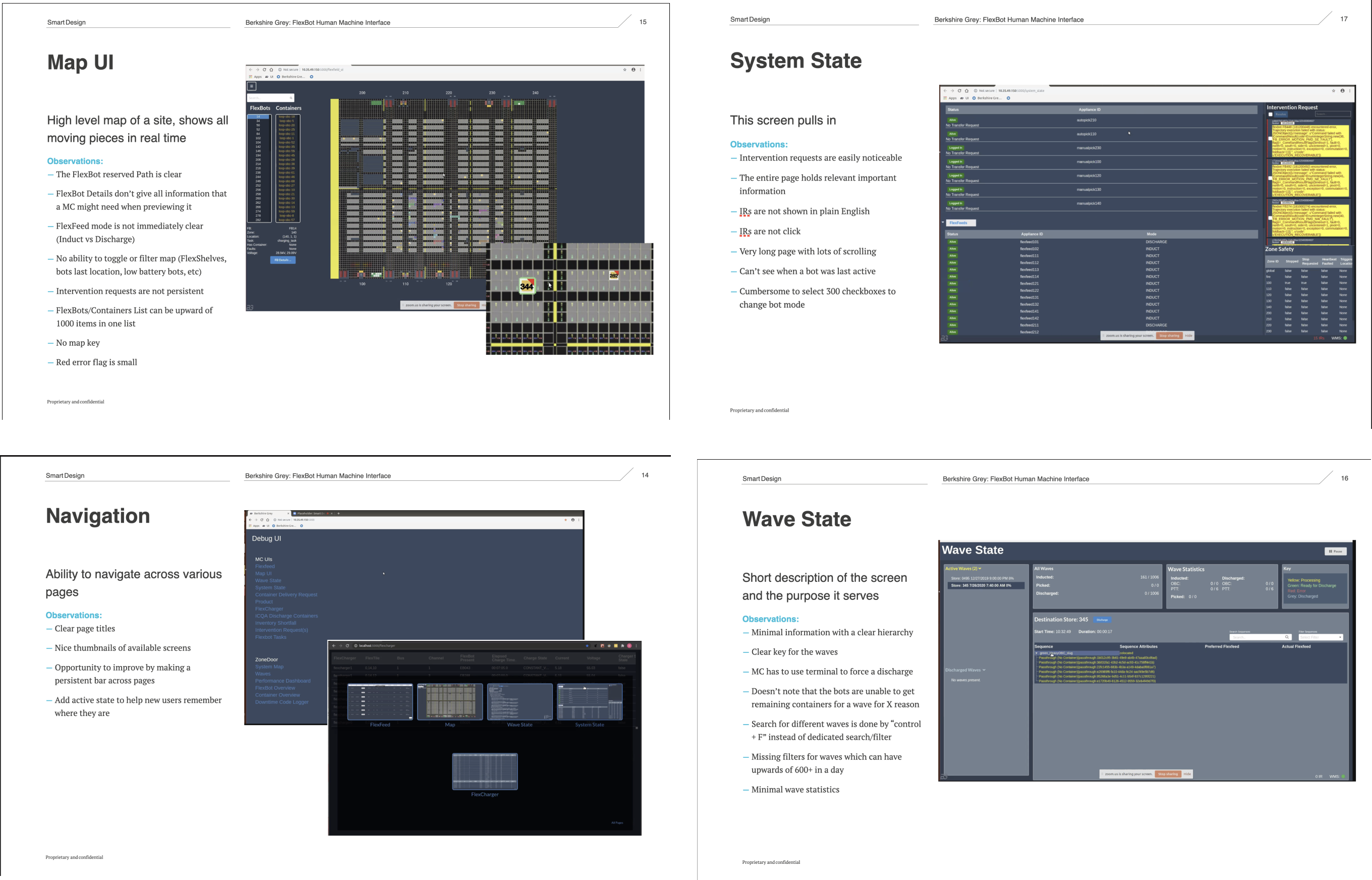
Then I evaluated in depth the existing system and areas it could be better
Finally we solidified key use cases and flows to focus on for the remaining engagement
/05 - Definition
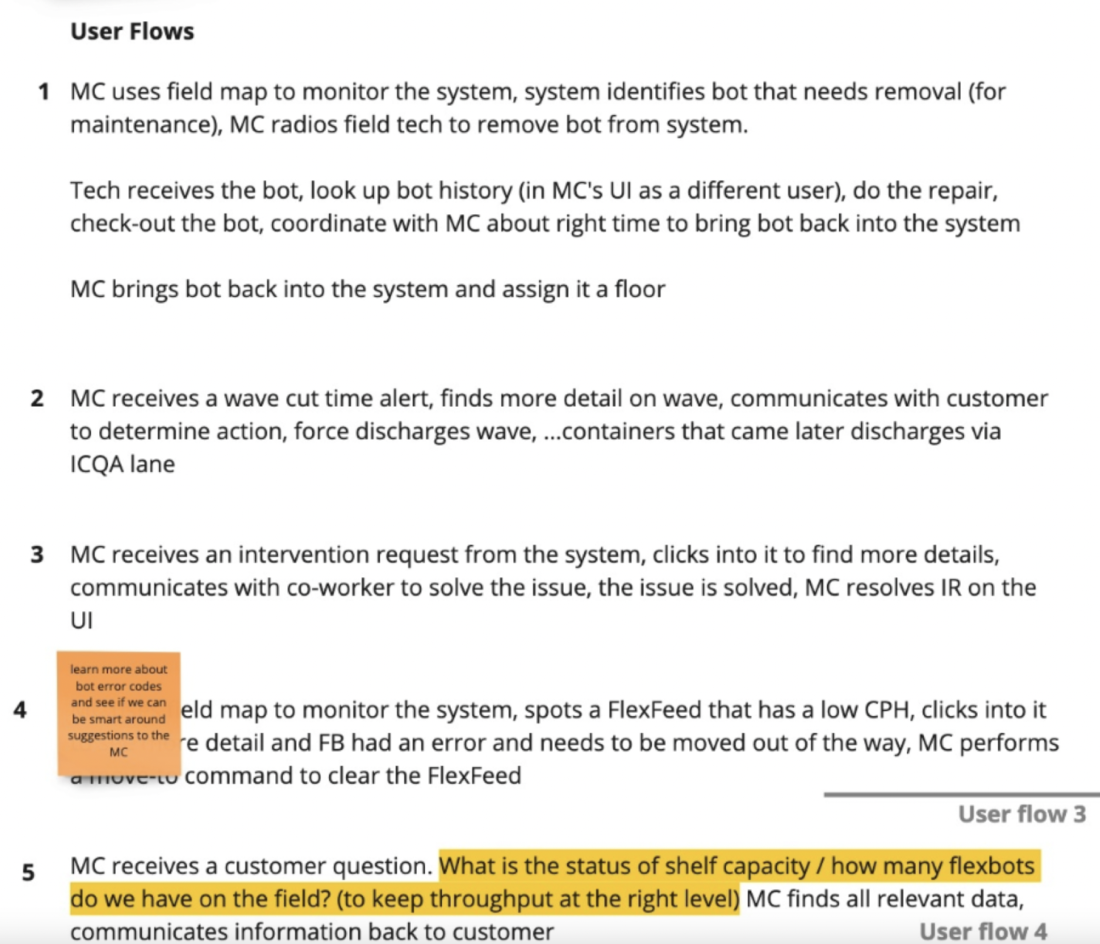
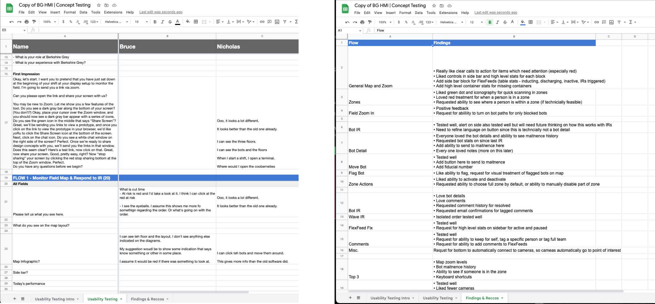
In greater detail, we mapped out our flows and needed screens.
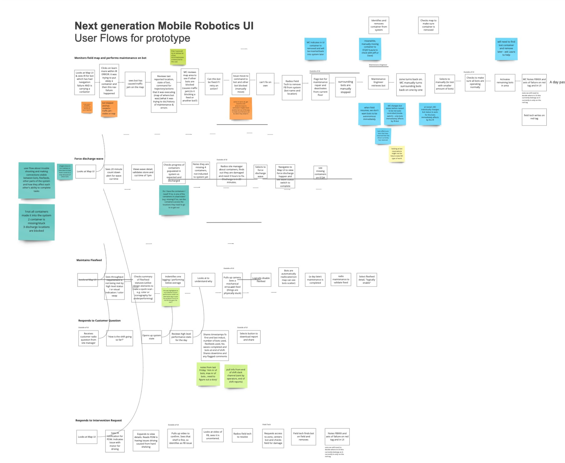
Then vetted new flows with MC (main user group) and jotted down any last minutes changes, feedback, & requirements
/06 - Wireframes
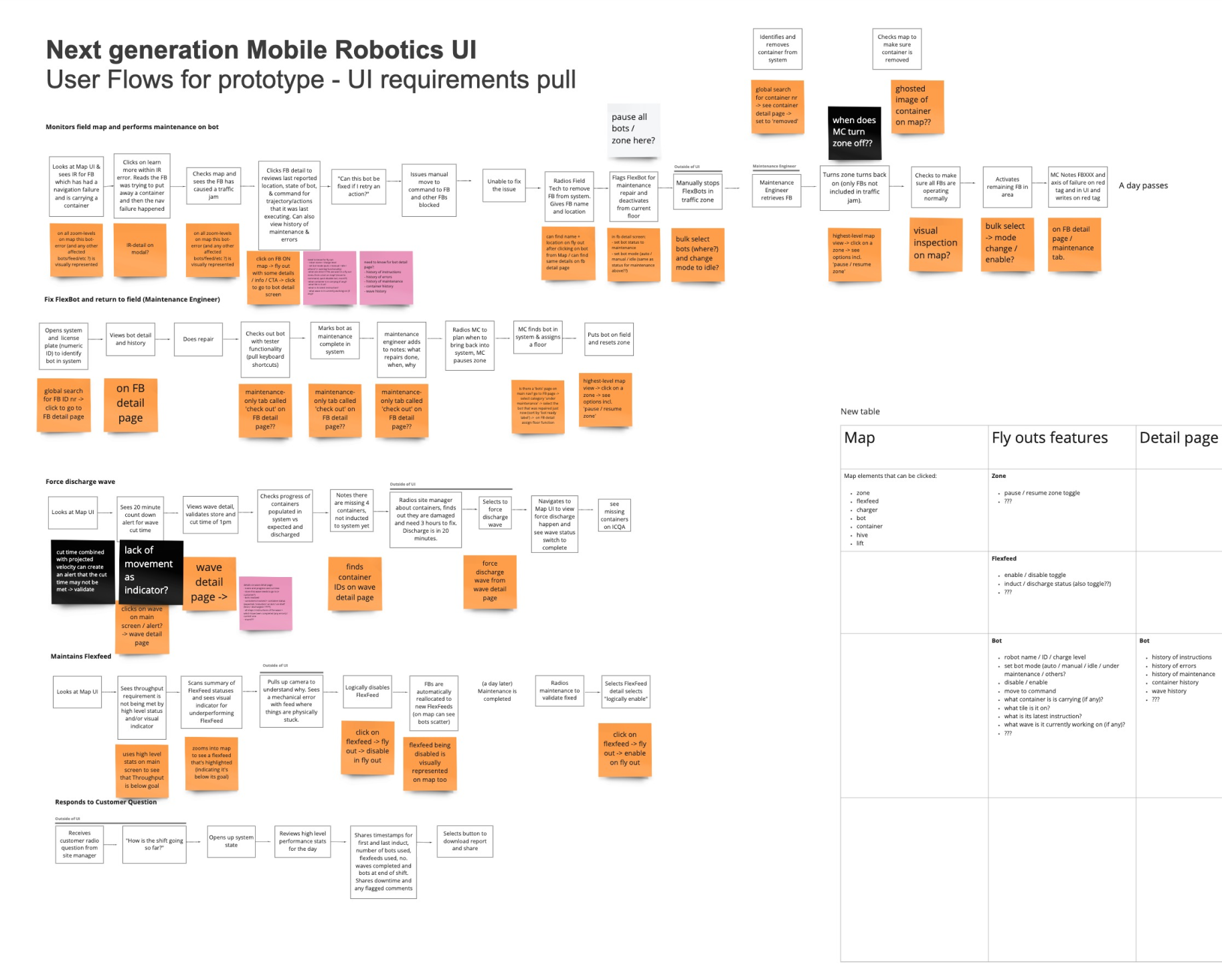
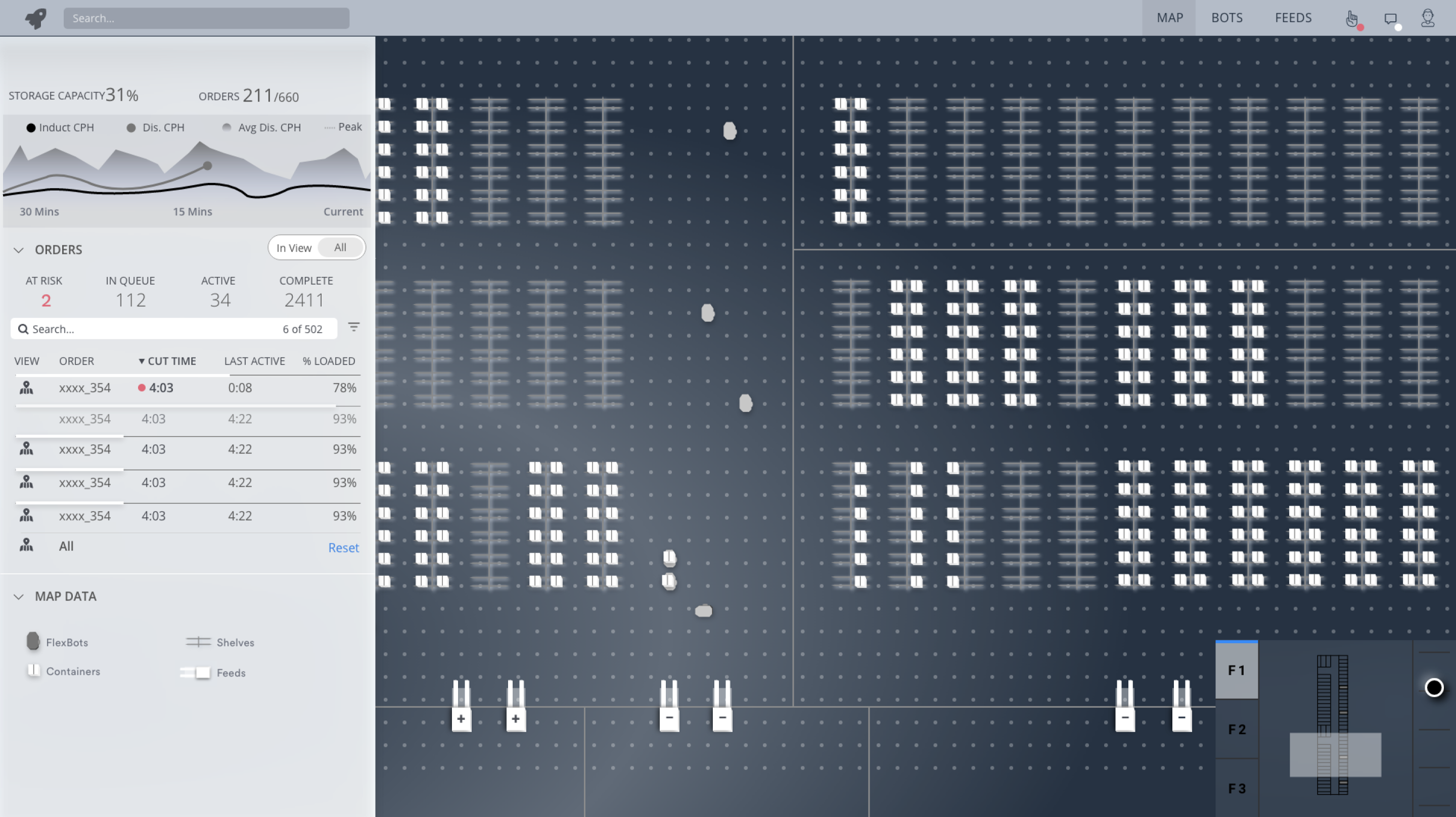
Then I created three different layout options for how I could display our key workspaces and primary controls.
• Layout option 1 provided greater flexibility in how the MC can choose to use the system w/ a focus on viewing the floor.
• Layout option 2 provided a fixed layout ensuring each MC works in the same fashion w/ important information persistent in left sidebar.
• Layout option 3 abstracted most information and took a more minimal approach pushing the user to dig deeper when issues arise.
After I performed concept testing and received feedback, we selected "layout option 2" as the way to go, and then were primed to push forward into visual design.
/07 - Visual Exploration
I created three different visual directions for us to consider for our new HMI. Also I themed them after birds :)

Visual Direction Option 1:
The Blackhawk

Visual Direction Option 2:
The Shoebill

Visual Direction Option 3:
The Gull
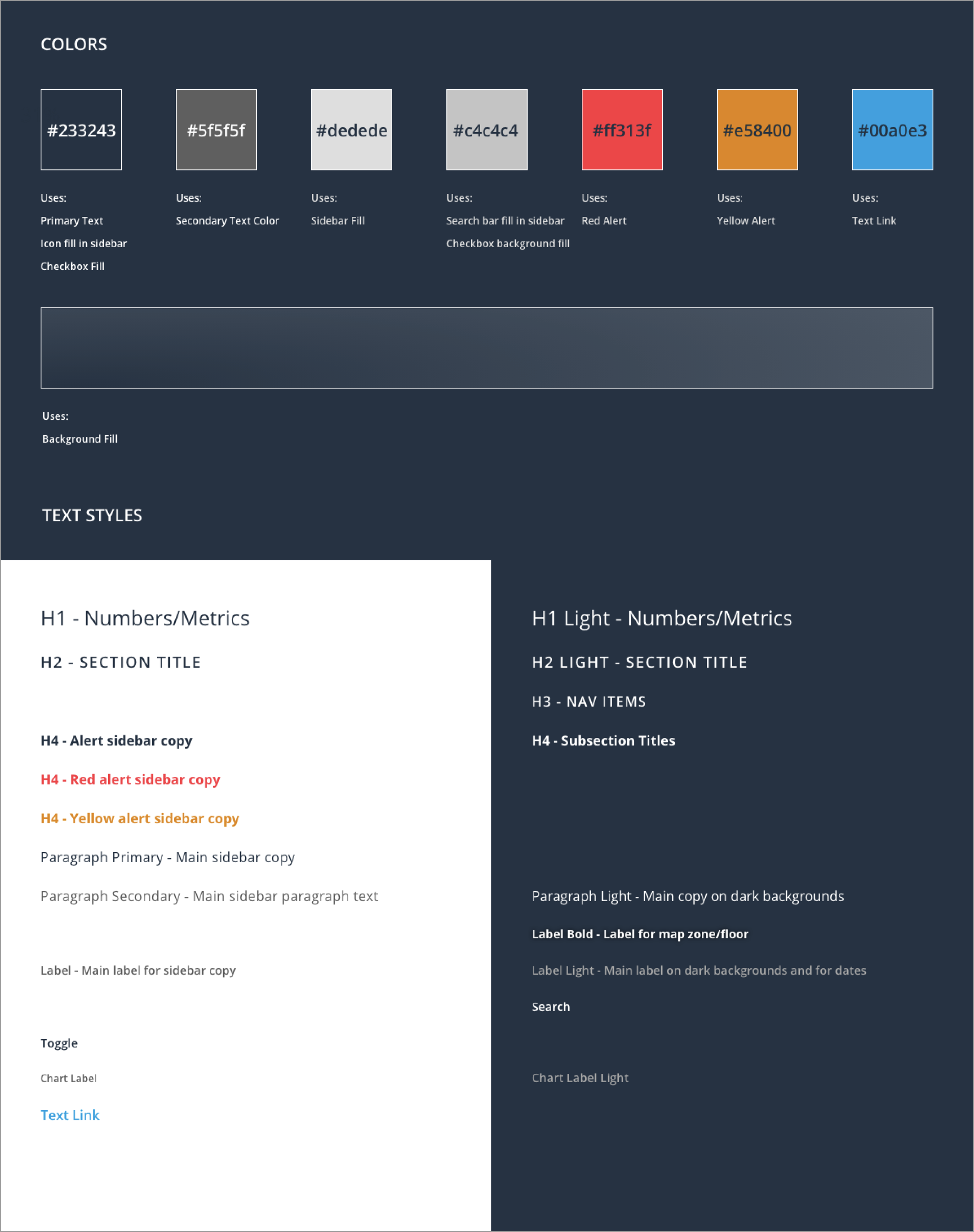
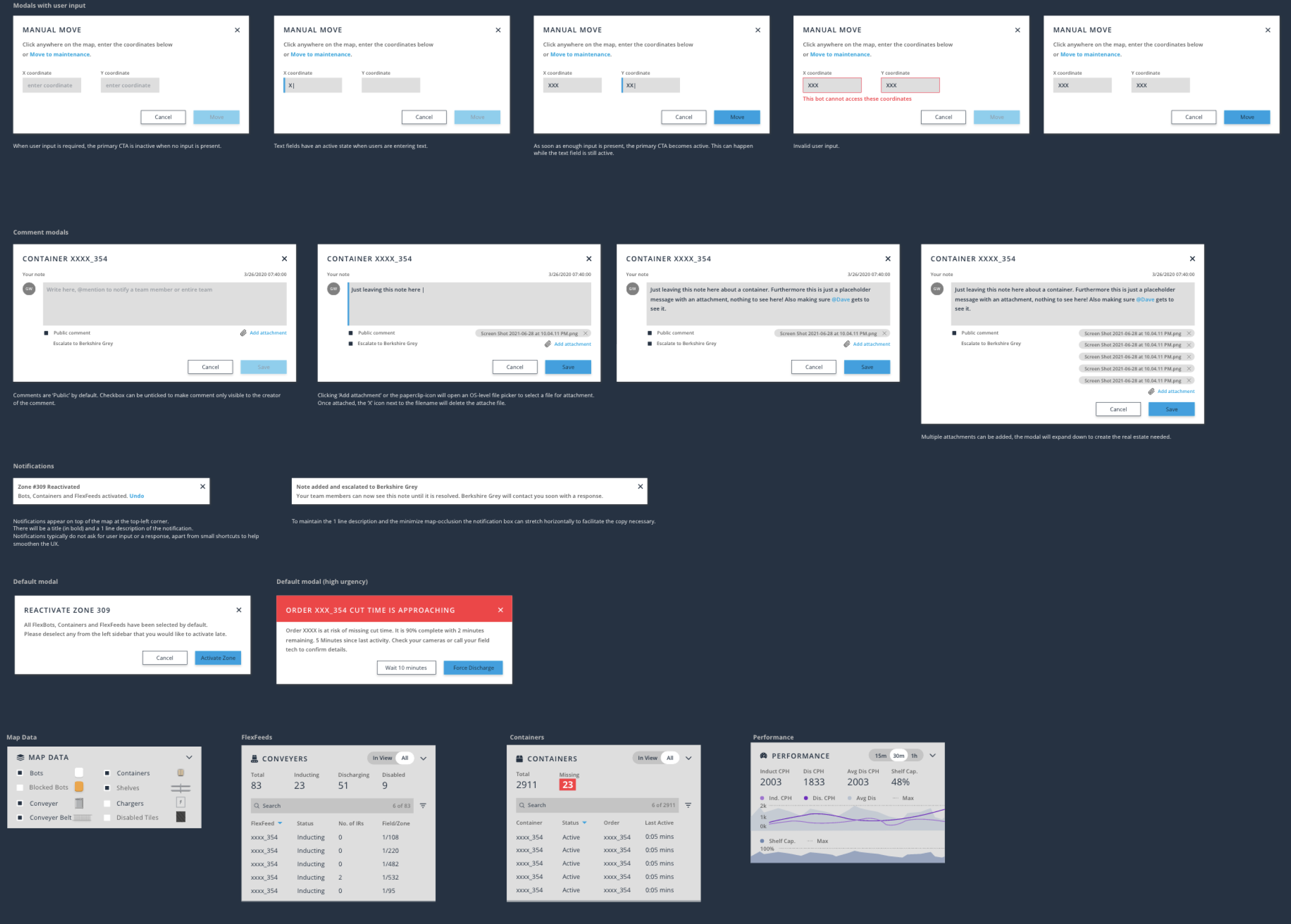
/08 - Design System & Component Library
Styles foundations created
Working components for the facility with robots, containers, flexfeeds, & nav components
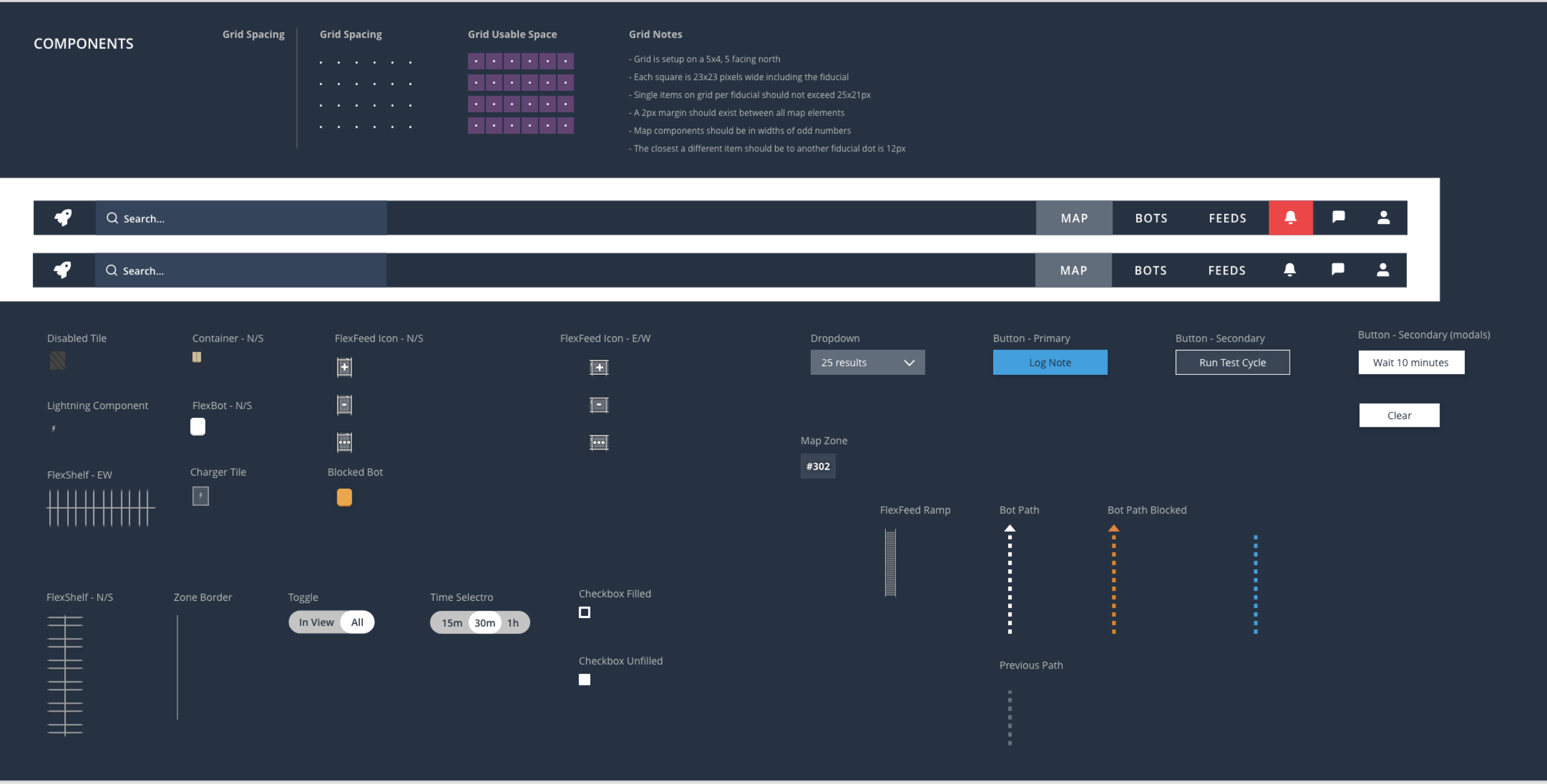
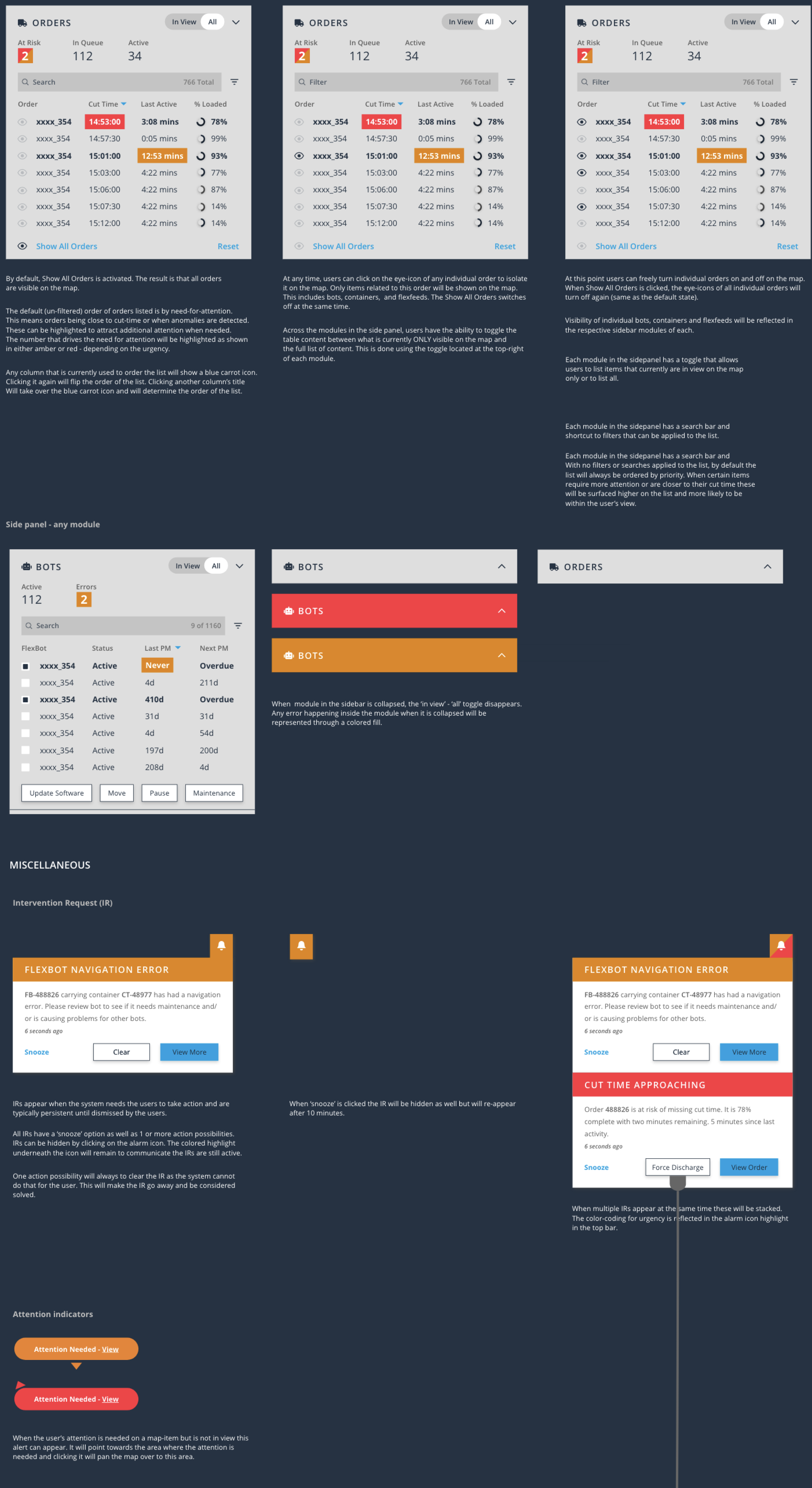
Larger, built out sidebars for the prototype that used our new styles & components.
Additional components for alerts & miscellenious items.
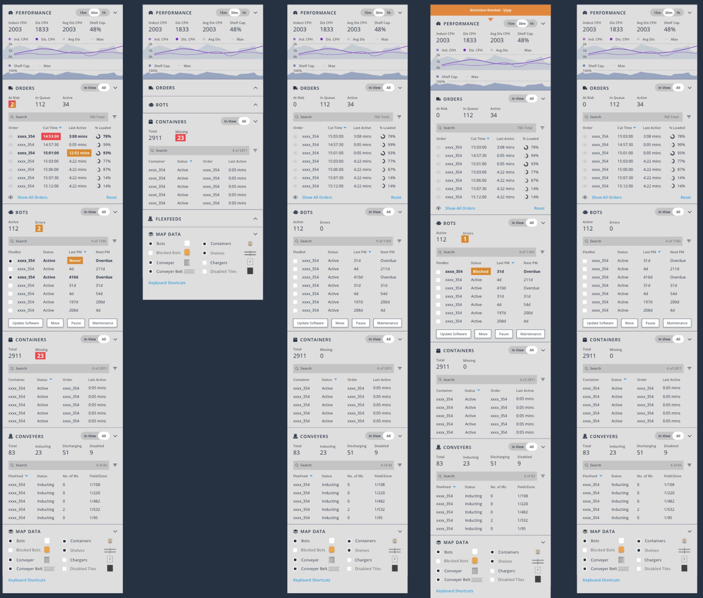
/09 - Protoype & Misc. Screens