FOCAL SYSTEMS
Computer Vision for Brick n' Mortar Retail
UX & UI
Android Application
/01 - Overview
Focal Systems Summary
Focal Systems is a startup aiming to tackle some of the most common problems in retail: tracking on-hand inventory, product availability, product replenishment, and wasted labor/time. They do this by taking their proprietary, small, battery-operated cameras and installing hundreds of them in a given store. The cameras take close-up photos of all products on shelves in the store once every hour.
I spent 5 months embedded in the Focal System team focusing on ensuring our product supported the needs of our new small retail partners (<5 locations) by improving our Action Tool (Android app for stockers) & Impact Tool (Management).
Project Goals
• "Become an expert in retail" to better design and advocate for store associates and managers."
• Make the Action Tool (mobile app shown above) easier to use for store associates.
• Help retail store associates adopt our system and support new pilot stores
Project Outcomes
• Refined Action Tool that is easier to navigate and provides feedback to user after they perform actions
Role, Team & Timing
• My Role: Product Designer
• Other Team: CEO, CPO, Customer Success Lead
• Varying timelines per feature/initiative
/02 - What is Focal Sytems
Focal Systems is a very unique company, all based around their proprietary on-shelf grocery cameras which photograph every shelf in a retailer once an hour. Then, their computer vision model determines exactly what products are in stock, out of stock, running low, and out.
/03 - Goal 1: Learn Retail
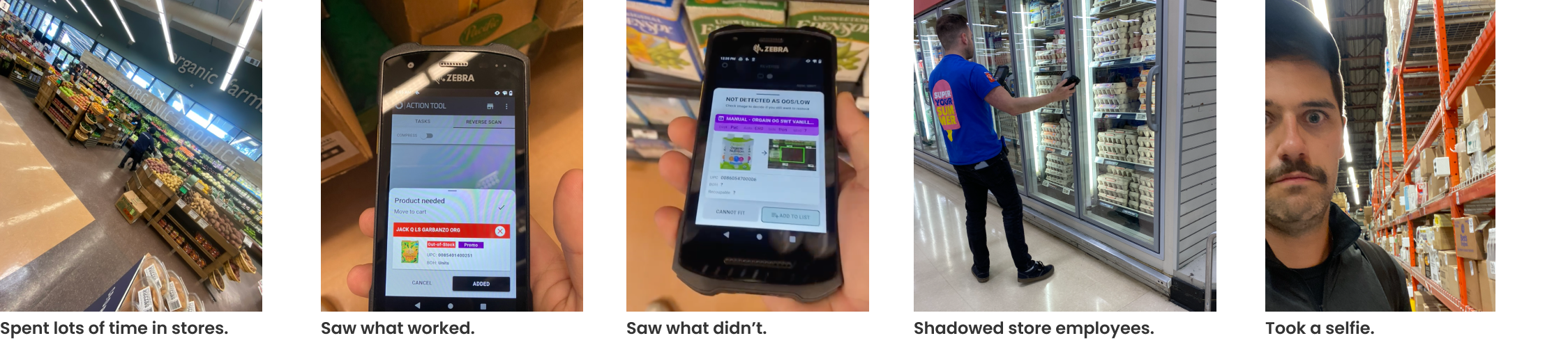
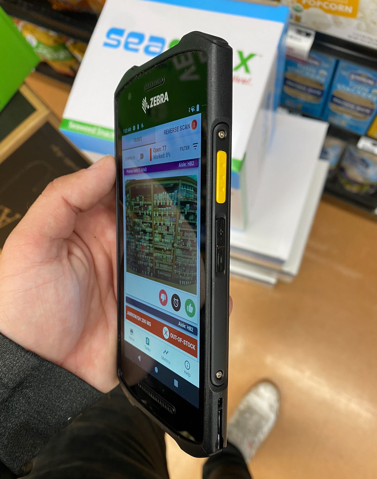
I started by familiarizing myself with grocery retail and understanding the in's and out's of an average employee. I visited a grocery store twice a week working alongside employees to learn Focal's tools, retailers' procedures, and ultimately the industry and the needs of Focal's users.
/04 - Goal 2: Improve Action Tool
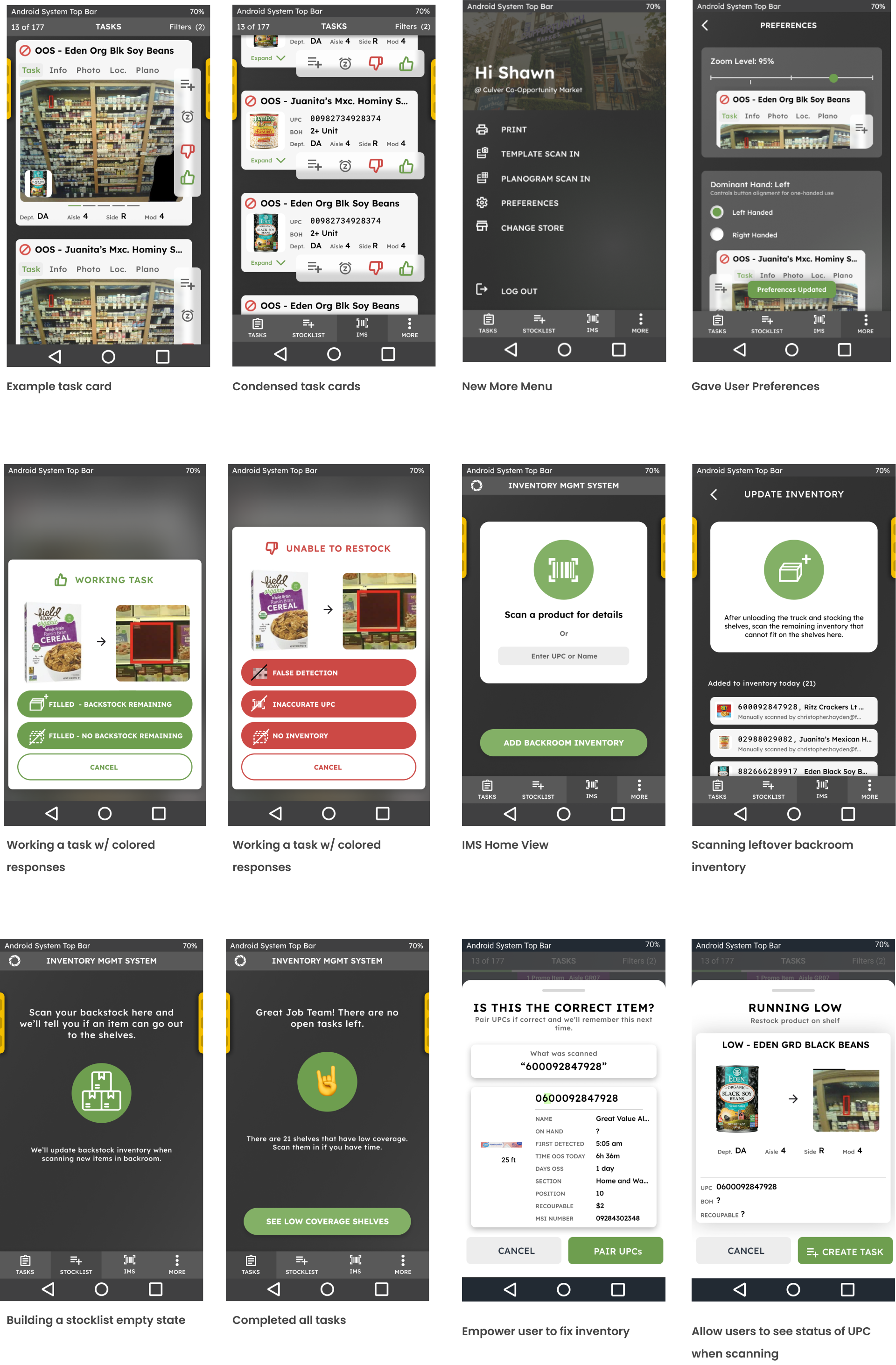
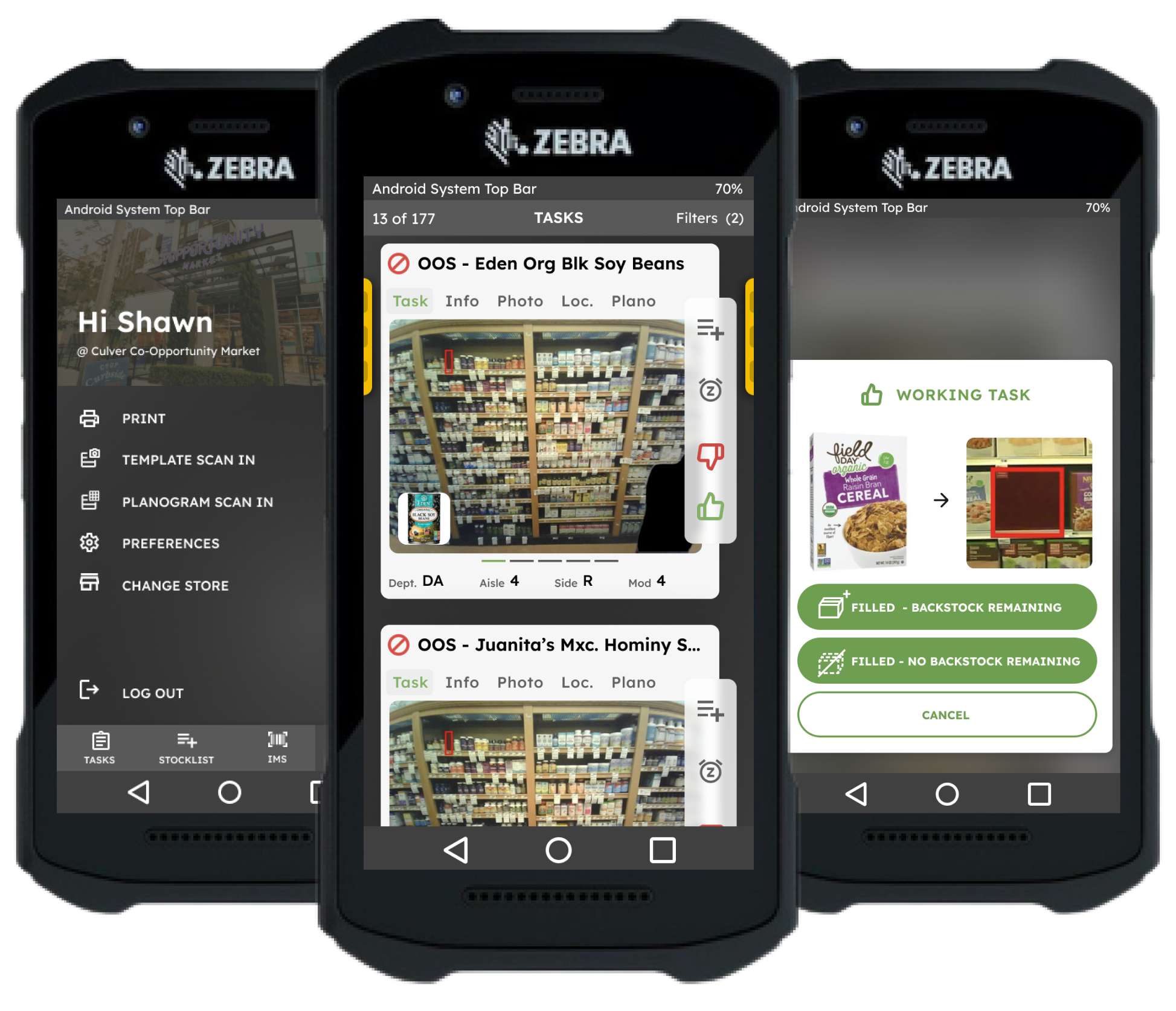
What is the Action Tool?
- The "Action Tool" is the main Focal tool that regular store associates use
- It runs on an Android device equipped with a laser UPC scanner
- The tool enables employees to see out of stock items, backroom inventory that can fit on shelves, and product details.
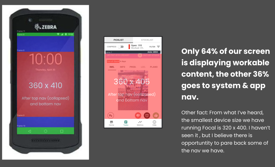
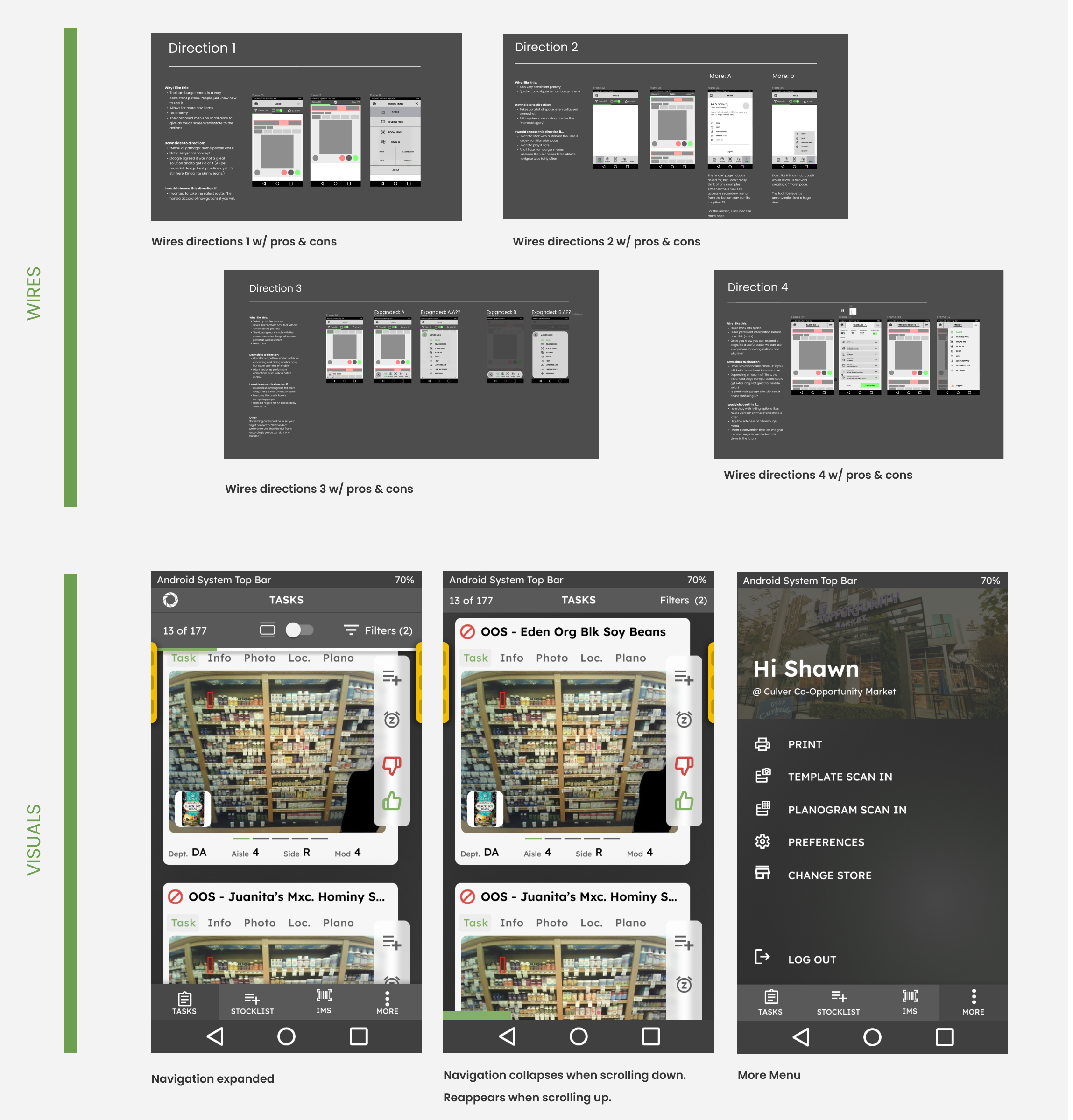
Improvement 1: Reduce navigation size. Only 64% of screen was showing content, the rest was wasted.
The New Navigation used 40% less screen space and incorporated minimum touch targets of 40px x 40px. Also added persistent yellow markers on side of screens which would show where the physical device scanner button was making it easier for smaller-handed users.
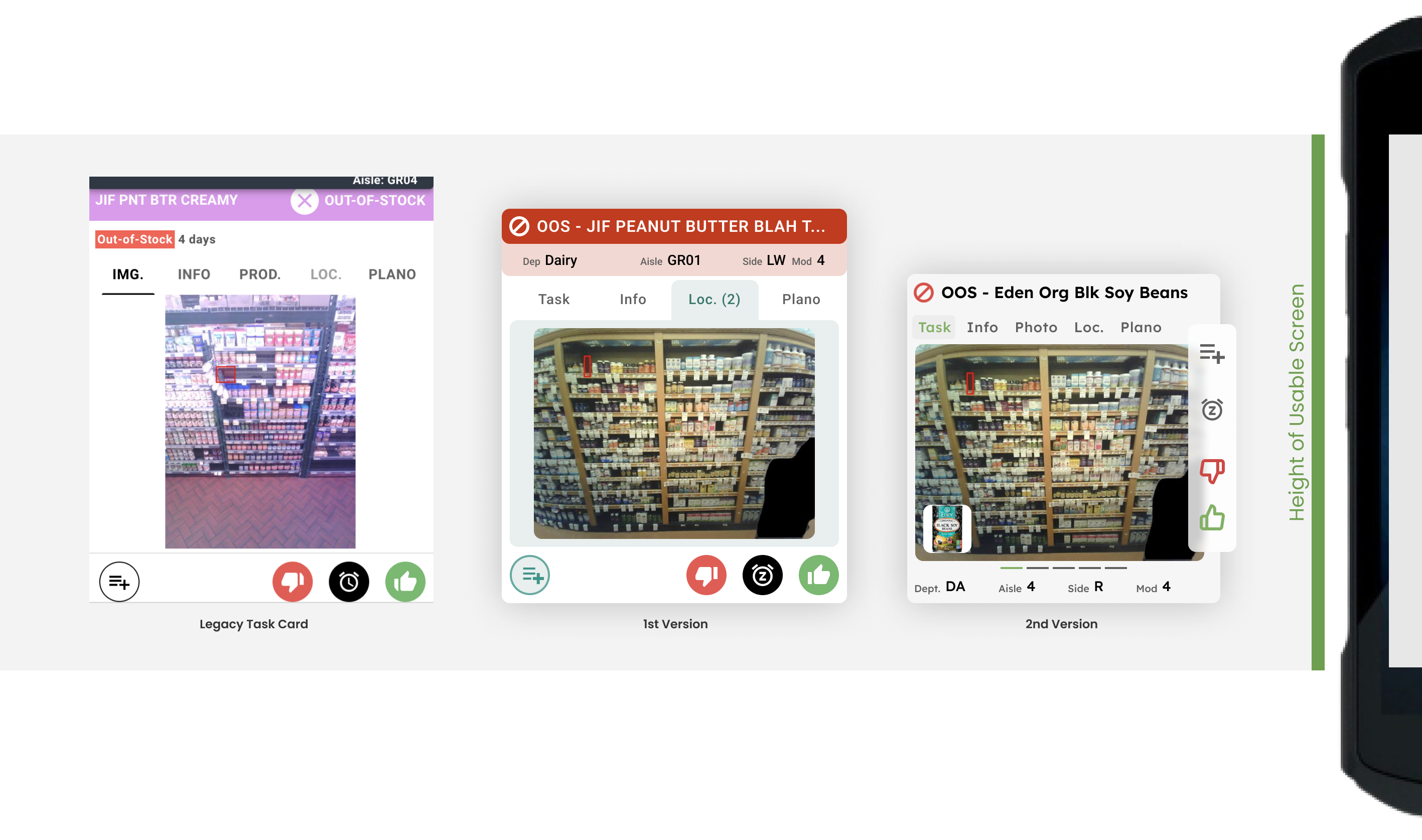
Improvement 2: Redesign action cards
Notable Improvements Include:
• New card designs made one-handed operation easier for users
• Incorporated swipeable gestures that made access to information easier
• Reduced card height so entire card would be visible on screen instead of being cut off
• Added grocery product thumbnail to card so user could clearly see product needing restocking instead of just the empty space on the shelf
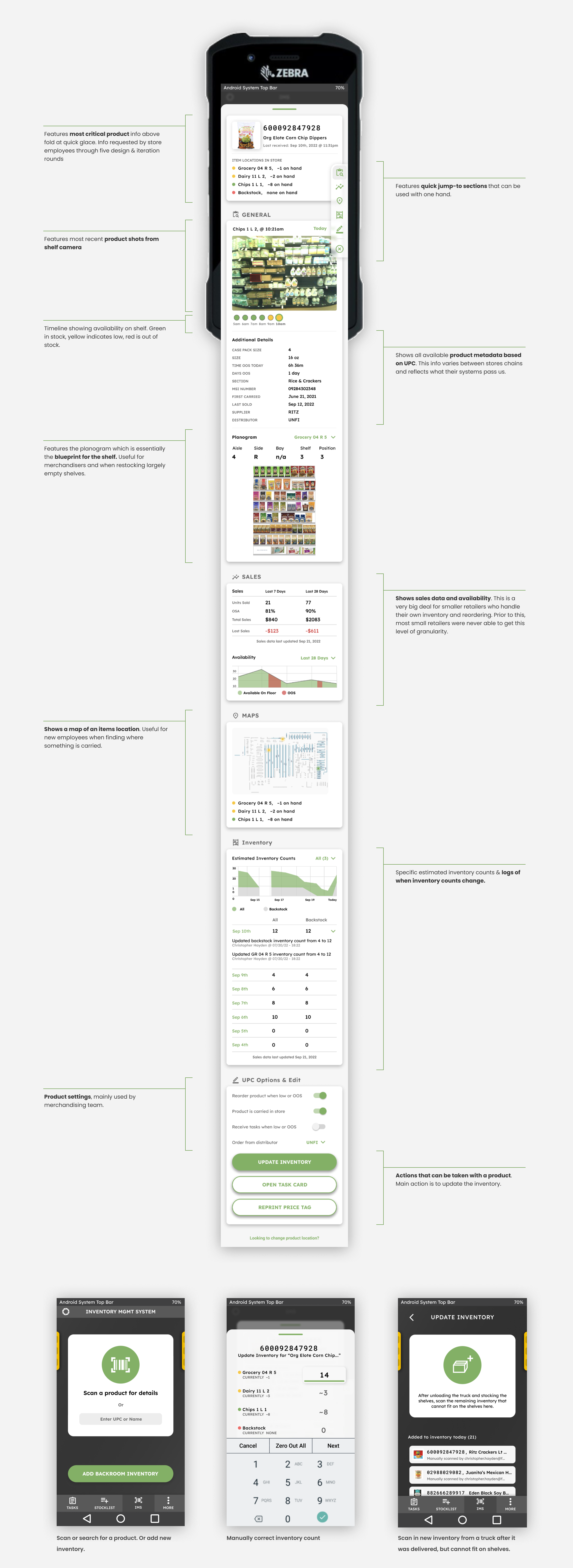
Improvement 3: Designed an IMS for our smaller retail partners that didn't have one before.
Improvement 4: Other Random Enhancements & Designs